#SWDChallenge Makeover
- 1 minIntroduction
I recently came across Storytelling With Data, and their #SWDChallenge. Sad that I missed their last round, I was quick to jump on this month’s challenge. The challenge this month was to revamp this figure depicting the change in global travel markets from 2000 to 2016.

The first thing I saw with this chart is the title, and I had absolutely no idea what APAC was. Only after playing with the data for a while, I realized that APAC=Asia Pacific, and that in 2016, this region has the largest share of the travel tourism market. While great to include a clear takeaway in a figure, it was lost in translation. Next, I realized that my eyes were constantly bouncing between the two pie charts, more so comparing the percentage values than the actual size of the pie (pie charts are notoriously difficult to interpret) So, moving forward, I knew I had to fix a few things:
- Use consistent acronyms across the chart.
- Provide a way for data to be directly compared, without the use of pie charts.
With these two goals in mind, I created a new interpretation of this data set:
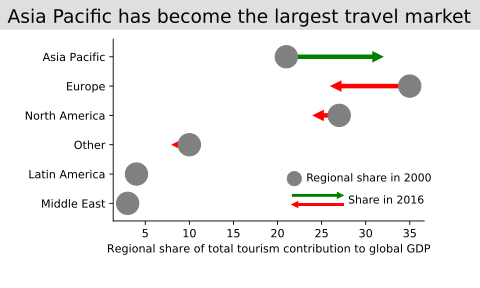
This plot was created with matplotlib, with slight modifications using inkscape (mainly for the legend). One aspect I wanted to highlight in this graph is the difference between 2000 and 2016, which is why I chose to emphasize this with arrows, coloured according to the direction. Only after I plotted this data, I could appreciate that Asia Pacific is not only the largest travel market, but also that all other regions have lost lots of this market share.
All of the code needed to plot this is hosted on my GitHub. Feel free to peruse and suggest any improvements!

Nishanth Merwin
A researcher tackling biology one keystroke at a time